Mise-en-scene is created in this extract through the use of outfits. The police officers all wear smart, professional outfits and all the police officers are matching, this connotes unity in the police department, which is further emphasised when PC Jake saves PC Ryan's life. The smartness of their outfits also connotes their professional outlook on work as well as authority over the public, especially the harmful people they are arresting in this scene. The criminals on the other hand, contrast fully with the officers, they wear untidy clothes which generally look old and dirty as well as having an overall scruffy appearance: many tattoos, messy house etc. This connotes them to be the bad ones in the extract and that they are clearly causing trouble for the police. There outfits are all stereotypical 'criminal' things to wear, making it easy to associate them to crime.
Another example of mise-en-scene to create meaning in the extract is the criminals home and the items inside of it. The house itself is a stereotypical council house, which is often referred to dangerous people and crime. The items inside of the house create meaning as the house is covered in alcohol bottles. This connotes that these people can be dangerous and inflict unnecessary conflict with the officers. It also connotes the type of people they are: possible alcoholics making them therefore unsafe and unpredictable to be around. The police officers have to fight the people in the home, risking their own lives to protect others from these people.
Wednesday, 27 March 2019
Sunday, 3 March 2019
OBSERVER FRONT PAGE Q9


On the observer front page there is diverse amount of ethnicity which represents Britain as a well diverse country and not just white men, like newspapers and magazines once only showed, this reflects the social and cultural contexts. Also, there's a large amount of different women on the cover, for example there is a women who is represented as fit and extremely sporty, her foot is even hanging out of the yellow box which could connote that she won't follow the 'stereotypical rules' of a women (like cleaning, cooking and others) but will do what she desires, in this case being an athlete. But on the other hand, there is the Great British Bake Off winner, she could be seen as following the stereotypical guidelines of females, a cook. The greatly contrast each other showing the social context of Modern Britain and shows how diverse women are now a days and that feminism hugely impacts our lives.
Men are represented almost vulnerably on the front page. The runner is in an anti stereotypical kneeling pose which connotes his vulnerability in such a competitive environment, a sports arena. This shows that men aren't always the hard going, competitive people which they can be deceived as.
Wednesday, 27 February 2019
'CLASH' MEDIA LANGUAGE
Write freely about the house style of Clash music magazine. Your focus is on 'media language', that is, how the musicians are represented, layout, font, colour and so on.

CLASH music magazine has a unique way of presenting their musicians. Unlike most music magazines, CLASH's colour scheme is extremely stripped down and just uses desaturated colours which connotes the artists as serious and also shows the magazine to be too. Similarly to many MOJO magazines, the musicians are seen to have a hard life and something seems to go wrong, CLASH also incorporate this into their front page, using words like 'living in darkness' which connotes this artists live life like many other famous musicians. This also connotes that they are extremely dedicated to their music and don't take their career as a joke, but rather seriously.
The main splashes often have their faces hidden by light, turning so they can't be seen or just aren't fully in shot, or the photo is fully blurred. The musicians rarely look directly at the camera (which would portray a bubbly, pop star) but rather face away, often looking up, into the distance or facing down. In the 1975 cover, the artist is portrayed as an angelic figure. He is looking up above him in a holy way suggesting his pureness, this connotes that he and his music is almost God like which fans would already agree with from his music. In another edition, the artist has got a gold tint of paint on his face which connotes his heroic music and how much pride he takes in it, by looking into the distance, once again connotes the reverent or God like feeling. However, other splashes are portrayed completely differently. For example, the Living In Darkness edition, his face is dropped low and we can't see his face at all, this is completely the opposite from many other magazines who would have the artist face directly to the camera to emphasise the connection with the target audience, which shows the uniqueness of CLASH once again.
The layout of CLASH is extremely simplistic with hardly any cover lines at all. The main header is in sans serif font and is large and bold writing, connoting the authenticity of the magazine. When cover lines are used, they often have the effect of falling off the page or aren't presented in a straight line which connotes CLASH's uniqueness and makes them stand out. It also shows that the musicians they include may not be the biggest pop stars trending, but unique artists aspiring to be different.
Monday, 11 February 2019
LEGO MOVIE AD BREAK
9 Analyse the representations found in the UK television ad break for The Lego Movie. [10]
To help you:
1. Identify the range of different representations.
2. Decide whether these are trusted brands.
3. Identify the target age group for these brands.
4. What aspects of 'real life' are represented?
5. How is humour used in the representations?
6. How is Emmet himself represented: in a traditional way as a masculine stereotype? Not entirely?
7. Is the representation of Wyldstyle a challenge to stereotypical representations of women?
1. the ad break represents a large number of different people and races and also features some locations across the country, representing England's lifestyle and nature
2. The brands featured are trusted. BT is the UK's biggest WiFi provider so is therefore extremely well known and trusted. The British Heart Foundation is an amazing part of the NHS, saving lives everyday, this is very trust worthy as they are only trying to get their message out their, rather than promoting it in the wrong way. Premier Inn is a very large hotel chain across the country and is very popular making it trust worthy too. Lastly, confused.com, this website has been around for may years and is very well known and 'Brian' is a vital part of it.
3. The target audience is focused towards adults. Warner Brothers doesn't target it towards children as they know the parents do the insurance, hotels, Wifi etc and by them seeing this would encourage them to take their children to watch the film
4. Real life is portrayed when the teenagers are talking to each other on the cars (confused.com), presently a busy working day in the city (premier inn) and even the fact that the advertise BHF as that is a very raw, real situation that can happen to anyone
5. The teens in the confused.com ad are very exaggerated to connote teens today but in a less serious way, making it humorous to adults as they can relate to their children acting like that
6. Emmet is a good role model for the audience, especially the younger viewers. He acts quite vulnerable and doesn't relate to the masculine action figures often seen today (batman and others). At firsts, he is seen as timid and trying to fit in but ends up saving the day, showing young children they can be themselves and will always have a positive outcome.
7. Wyldstyle is very strong and brave, showing women are just as strong and action packed as men. She definitely challenges female stereotypes, like building a motorbike and riding it across the city. This is very encouraging to female audiences as she is a hero rather than a 'house wife' or allowing the men to do all the hard work.
Wednesday, 6 February 2019
JONI MITCHELL MOJO MAGAZINE
Analyse the representation of musicians in extract 1, which is from MOJO magazine:

The magazine cover uses monochrome colours and a simple colour palette as well as a pop of blue and red. This use of colour connotes seriousness and that the magazine deals with serious music artists. This is further supported through the use of Joni Mitchell being in monochrome which further suggests the importance of music.
MOJO usually has quite a masculine feel towards it and although this magazine still has a masculine colour scheme, a woman is represented. This shows that although MOJO is quite masculine dominated, woman are still seen as excellent musicians.
Next, the rock feel is further emphasised with the words said about other musicians. "Pete Shelley: a different type of punk" this shows that most musicians on the MOJO front cover are hard core men, with exceptions like Joni Mitchell for instant.
Sunday, 3 February 2019
THE AVENGERS: REPRESENTATIONS OF GENDER
HOW DOES THE AVENGERS CHALLENGE TRADITIONAL REPRESENTATIONS OF GENDER TO REACH A 1960's AUDIENCE?
In the 1960's Avengers, Emma Peel is represented as a strong, independent women who doesn't need to be ruled by a man, like Steed. This is getting the message out to the audience that the traditional representations of gender in the 60's is changing and that women like Peel challenge traditional stereotypes of men being in control and holding all the power, which was extremely unusual at this time as women were stereo typically house wives who catered for their husband and family. Emma Peel is portrayed as an extremely intelligent women and solves the cases on her own, often she answers back to Steed which connotes she can hold her power and will stand up for herself. For example, when Steed is in her house, he asks for coffee and instead of Peel going to get it for him she instructs him where it is so he can get it himself. This shows that Peel won't be bossed around by a man and really wants to challenge the stereotypes of the time where women were meant to do things like this for the man.
Emma Peel makes it extremely obvious that she can look after herself and doesn't need a mans help. We know this because when Steed comes into her apartment, she is fencing which portrays her as an active young women who was practising a typical 'manly' sport. When her and Steed begin fencing, she holds a fight well and isn't afraid to fight back. This was very unusual in 1960's T.V and connotes that Peel will fight for equality. During the fight, Steed taps her bottom with his fencing stick, this nowadays would be seen as sexual harassment but back in the 60's Peel didn't think anything of it and allowed him too without telling him off.
Emma Peel once again goes against female stereotypes and rather than wearing a skirt and shirt, she wears trousers to work which was seen to be a masculine thing to do. Her outfits were all very tight and flattering which could sexulaise her character. Overall, Peel fights all the stereotypes of the 60's while Steed does the complete opposite. He still expects the women to do things for him and also treats Peel as a sex object from time to time.
Analyse the representation of Jamaican Reggae music and musicians such as Bob Marley in this MOJO front cover. (5 marks)
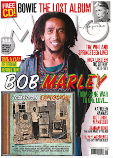
In this MOJO magazine cover, MOJO use colours of white, red, yellow and green which connotes a fun atmosphere, also these are the colours of the Jamaican flag which associate with reggae too. The fun atmosphere is further represented by Bob Marley looking extremely happy, looking right into the camera lens making it look personal, warm and friendly. This idea that Marley portrays is very different to the typical MOJO magazines where it is stars in their prime time and often in monochrome to connote seriousness. Not only this, but the crumpled monchrome poster on the bottom left shows the idea that reggae is quite an old style of music and has been around for a while but also may suggest that countries which reggae come from where in poverty and life wasn't as easy for them.
'Marley' is said in extremely bright fun colours which are once again the colours of the Jamaican flag which represents Bob Marley being a lively figure who people look up too but also shows he's very important as it's the boldest word on the cover.
Wednesday, 16 January 2019
Q9 OBSERVER ONLINE: MESSAGES & VALUES PREP
1. The major use of newspapers is to offer a sense of knowing what is going on in the world.The Observer knows that its readers are serious and interested in international affairs. This is evident in hard news articles about..... LABOUR SET TO CALL VOTE TO TOPPLE THERESA MAY'S GOVERNMENT and MoD SENDS PLANNERS TO MINISTRIES OVER POST-BREXIT BORDER FEARS and TAKING BACK CONTROL? BREXIT SEEMS TO OFFER EXACTLY THE OPPOSITE
2. The Observer meets its audience's need for a range of cultural, sporting and artistic news. It provides these with... 2019 BRIT AWARD NOMINATIONS TOPPED BY ANNE MARIE AND DUA LIPA AGAIN and ROMA/ OSCAR CONTENDER STIRS UP NOSTALGIA AND GUILT IN MEXICO'S MIDDLE CLASSES and BODY IMAGE/ WHY LEADING MEN ARE DRIVEN TO BE BUFF
3. The Observer does not shy away from 'difficult' issues that could make uncomfortable reading, such as... KINGS OF COCAINE and PRISONS AND PROBATION and NAZANIN ZAGHARI-RATCLIFFE/ CAPTIVE FEARFUL AS SHE PREPARES FOR IRAN JAIL HUNGER STRIKE
4. The Observer has sections which are designed to appeal to different types of readers.The Observer reflects the diversity of its readership in articles on... CHRISTIANITY IN CHINA and SLEEP DEPRIVED PUPILS NEED EXTRA HOUR IN BED
5. Newspaper readership can still be used as a symbol of one’s social identity. The term ‘Guardian reader’ connotes a certain type of social attitude and The Observer similarly reinforces a set of social and political attitudes, and thus identity, in its representations. For example, Observer readers like to think of themselves as open-minded and this is reflected in the Observer’s practice of allowing both sides of an argument equally to be put when the newspaper is clearly on one side of this argument. There is an example of this in.... SLEEP DEPRIVED PUPILS
6. The entertainment function of newspapers may take the form of humour. It may take the form of diversion into a celebrity world of ‘glamour’. It may take the form of human interest stories in which readers are invited to sympathise with the subjects of the article. Newspapers further offer games,puzzles, crosswords and the like. At the higher end, sections such as the New Review in the Observer may offer the pleasure of extremely well-written think pieces and literature reviews. An example of this is.... 2019 BRIT AWARD NOMINATIONS TOPPED BY ANNE MARIE AND DUA LIPA AGAIN
Q2 MUSIC VIDEO PREP
This video is documentary style mostly hand-held camerawork, de-saturated colour and fast-paced editing SB
This video has saturated colour, more controlled camerawork, slower-paced editing TD
This video consists of mostly montage shots. SB
This video has more developed editing with cause and effect TD
In this video, the singer values rebellion, which is seen in the narrative. SB
In this video, the singer values 'fitting in', conformity, albeit to an oppressive system, which is seen in
the narrative. TD
This video is set in LA, a big city, with its connotations of street credibility. SB
The mise-en-scene of this video is American suburbia with its connotations of conformity. TD
This video is intertextual in its narrative (=it makes references to high school drama). TD
In this video, the singer performs to camera. SB and TD
In this video, real locations and 'everyday' costume for the performers connote a sense of
naturalism. SB and TD
In this video, there is a sense of linear narrative (a story is told, in the order it unfolds). TD
Friday, 7 December 2018
Q4 Analyse the representation of musicians
Analyse the representation of musicians in Extract 1, which is from MOJO Magazine.

The magazine extract uses a simple colour palette of monochrome colours and uses white and brown writing with an accent colour of red. This use of colour connotes a serious tone towards the magazine and the artist Nick Drake. This is further supported through the decision of the editor presenting Nick Drake in black and white with his head covering the title of the magazine which once again shows seriousness and respect towards Nick Drake.
The magazine has quite a masculine feel to it, partly due to the colour scheme used. The masculine feel is also portrayed through the other artists discussed, including Nirvana and Krist Novoselic. All of these artists or bands are male dominated which suggests that the world of rock is male dominated and enjoyed by a male target audience, which is further reinforced by the monochrome colour scheme and capitals for the coverlines.
This feeling of masculinity is further reinforced by the choice of language used in some coverlines. Phrases such as 'Krist Alive!' and 'war and peace' connote a sense of struggle or a battle to live shared by many of the artists covered in the magazine; use of words like these are stereo typically male.
Finally, MOJO magazine is challenging the stereotype that music is dominated by younger artists as it is representing 'authentic' music as being the domain of the older, more established artists such as Nick Drake.
Sunday, 2 December 2018
OBSERVER Q9
'The representations featured in the online Observer reflect its values and beliefs'. How far do you agree with this statement?
The Observer and the online Observer are publications that sit towards the left of the political spectrum and as a result concern themselves with values and beliefs that are more socially liberal and not usually sensational in their content. The online Observer shares their values, they aren't prepared to voice their opinions, they discuss worldwide news rather than just the UK and they also discuss politics and international affairs. Something else they also do is featuring women who are in empowerment which many people around the world enjoy reading about.
Firstly, the online Observer doesn't just discuss news within the UK, but all around the world. In the extract given to us, we as a reader see that there have been articles about US immigration, Saudi dissidents who can finally voice their opinions and also an article about Jamaica. This connotes that the Observer want to discuss international affairs rather than things just within the UK which many other newspapers do.
Next, the Observer also includes diverse and inclusive articles. It is obvious that they are interested in all sectors of society as in the article given to us, health, NHS, diseases, people mourning and many more. This represents all of the voices of the unheard which connotes inclusiveness and seriousness to insure every topic is discussed.
The online Observer also isn't afraid to tackle difficult issues. For example, they mention death, brexit, bullying and other difficult issues to discuss. This connotes that they have a robust understanding of all sorts of issues and are prepared to discuss them.
Something the online Observer does too, is value culture just as much as hard views such as politics. For example, mentioning of Saudi Arabia and Jamaica signals that the Observer understands all cultures which connotes they value culture and other countries.
Therefore, the online Observer evidently reflects all values and beliefs even if people don't agree with them.
Thursday, 29 November 2018
OBSERVER Q8
Media Language is used on the online Observer to create meaning. The colour palette on the online Observer is a royal blue with an accent colour of burgundy, this connotes seriousness towards the online Observer as the colours are quite simple yet effectively symbolise seriousness. Whereas if the colours were bright yellow and green, it might portray a less serious layout and therefore have a younger target audience.
Similarly to this, the Online Observer has a very linear layout and is extremely orderly and has certain groups per category. This connotes seriousness as it is very orderly and may also show that the target audience is slightly older and more serious.
Friday, 16 March 2018
MOJO MAGAZINE EXAM Q4
Refer to extract 1 in the insert. Analyse the representation of musicians in Extract 1, which is from MOJO magazine.

On this MOJO magazine cover, the main splash is covering the head line, 'MOJO', because it is such a popular and familiar magazine brand, everyone knows what it is called just from the font and a couple of the letters. Because the artist is covering the head line, it is clear to the audience that he is the main splash and is the most important thing on the magazine cover. Supporting the main splash, his name is in big bold writing next to him saying 'RAY DAVIES' this evidently shows that he is very important to the cover, and is the main topic.
Ray Davies is staring up into the distance and not towards the camera which creates him as a figure we should all look up too, it makes him seem sophisticated and a good role model. The colour scheme is black and white with the feature colour being yellow. Because the colours are so monochrome, the colour yellow stands out a lot. The puff is in yellow which makes the readers eye gravitate towards it which suggests there is something exclusive inside the magazine.The cover lines are pushed either side of the main splash. The ones on the left are all pushed towards the side making it look tidy and professional, the same is done on the right. On the right, the writing with the biggest font and size is in a triple deck, making it look smart. Notice how none of the writing is covering the main splash, this connotes that he is the most important and significant thing on the cover.
Wednesday, 14 March 2018
SCEEN SHOTS OF SOAP OPERA

The title sequence gives us an idea of where Coronation Street is set and what it is called

This image gives us an idea of what these characters house looks like and how they like to live, for example, we can see that they have beer cans everywhere and that it is messy

This shows the women's reaction to something, we can already tell she is a main character as she is on it straight away

This shot reverse shot shows that the man is angry and is in an argument.
Thursday, 1 March 2018
QUESTION 3 CUFFS
In this question you will be rewarded for drawing together elements from your full course of study, including different areas of the theoretical framework and media contexts.
How far does the extract try to create a sense that it is portraying 'real life'?
The extract from Cuffs that we see does portray 'real life'. It does this through the use of realism, firstly, the scenes are always set in naturalistic locations, for example, when the police officers are in the shopping precinct, the lighting is very natural unlike some TV shows where it is high key lighting which is very unrealistic and staged. Also, it shows realism because a lot of bad things happen as well as good things, for example, when Jake's sandwich arrives, he can't eat it because he is in a rush and therefore has to leave which shows realism. Finally, their costumes are also very conventional which makes them look more convincing and realistic.
Editing is a key theme to make a show realistic, the use of continuity editing and conventional camera work adds to realism, for example, the use of shot reverse shots makes the series seem less artificial and more as if they characters are just generally talking in their day to day lives. Also, when the PCSO is being threatened, the camera is being hand held as a pose to being very stable and on a tripod, this gives the audience the feeling that she is scared which suggests documentary realism.
The use of generic conventions of the police drama with the young rookie and old hand show a sense of realism as there is usually an older cop mentoring a younger cop, and in the instant it is Jake and his mentor Ashely. There is always also a team of officers, including different genders and ages which fits the audiences expectations and doesn't undermine a sense of reality. Also, they use stereotypical characters to connote realism, for example the criminals are all male which enables instant interpretation which makes the scene appear more real. Contrasting with this, they use deliberate anti-stereotypes like when the female beat officer is in a head scarf, which may reinforce a sense of realism. This helps the audience connect with this character because if you were from an ethnic background that wore a headscarf and they was no representative of this in Cuffs, they may feel that going into the police career isn't for them.
Finally, the extract offers the audience entertainment and diversion for example the visual spectacle of the robbery and the opportunity the audience has to identify with the group of the police officers and how they act like when they were having some lunchtime banter, these mainstream uses and gratifications enhance the realism in the extract.
Wednesday, 21 February 2018
QUESTION 2 CUFFS
Analyse how far the extract depicts the police's point of view rather than the criminal's point of view:
In this extract, the polices point of view is the one we see the most, there a many points that show this but the first one being that the police are presented in many more close ups compared to the criminals
In the extract the police are presented in many more close ups compared to the criminals who are mainly seen in longer shots where the audience can't completely see their facial expressions, which hints to us that they are just known as criminals whereas we get to know the officers very well. For example, in the dining hall, there are many close ups of the police officers while there are just long shots of the criminals.
Next, the editing is very smart and makes the police officers seem more dominant. When the criminals do something wrong, it immediately follows with the police officers reactions which shows that the criminals are in the wrong and the police clearly think badly of it, however, if the police acted and did something, there would be no closeup of the criminals which shows that they are of less importance.
Music is a huge role of creating 'goodies' and 'baddies'. The criminals are often portrayed onscreen with non diegetic sinister and suspicious music which connotes that they are the villains as appose to the police being the bad ones. This once again shows that the extract is from the polices point of view.
The criminals have a very stereotypical costume which hides any characterisation for the audience to see so that we can't find out about their true personalities. Whereas the audience have a chance to really relate to the police officers. For example, we see a lot more individuality of all the officers like when the new, younger officer has to leave his food and lunch early because the criminals have done something we get to see his facial reactions and how he feels. We get to relate to these characters more as we see way more of them. This connotes that the officers are the ones we should support purely because it's in their perspective.
The narrative mainly follows the world of the police, the only time the criminals are showed is when the police are also present (because of the criminals mistakes). When Jake was eating lunch we saw a lot of close ups of him and how he felt however the audience would never see the criminals eating their lunch.
Finally, a narrative is also constructed, in which the relaxation of sympathetic characters is then disrupted by lesser known characters like the criminals. There is a lot of cross cutting of this when the officers are eating lunch in the canteen and when the criminals are robbing a shop. The cross cuts connotes that the police are the good ones in the situation while the criminals are in the wrong completely.
Tuesday, 20 February 2018
QUESTIONS 1 CUFFS
Analyse how sound is used in the extract to create meaning. Refer to at least two examples from the extract in your answer:
The use of diegetic sounds in the extract such as the vehicle smashing into the glass connotes the amount of violence and action that is going on. Similarly, the diegetic sound of the sirens creates a sense of fear and danger for the audience while it also immerses the audience into the life of the programme.
Next, there is a use of background sound, when they are in the cafe there is a lot of chatter and diegetic music which makes it seem more realistic and surreal. It is very effective when we can hear them speaking on their radios, yet we can see something different, this use of off screen speech is effective as it gives depth to the narrative.
Finally, non-diegetic music was added in during the robbery and car chase which connotes a sense danger and it exaggerates the experience even more and adds tension.
Thursday, 1 February 2018
QUESTION 8

The Observer uses a lot of methods in media language so readers can interpret the newspaper in their own way. The dark blue colour at the top shows importance of the Observer and their name. The burgundy colour symbolises the importance of certain news articles and that they are the ones most people want to read. The online observer includes ads, famous people, brands and companies for their advertising sake and also for these brands and people to get known of. The observer is quite modern as it doesn't have the typical font of a old fashioned newspaper and font is sans serif which gives it a modern feel. The typeface of the Observer implies ideas of importance. The lines are very short which catches the readers eye and then when they click onto it, it goes into more depth. The use of other peoples views in first person allow the audience to relate to the newspaper, it makes it more relatable to the reader as other people may be experiencing what is happening and by using the comment section people can discuss their views. The Observer uses a lot of hyperbolic, emotive and sympathetic language that drags the reader in. For example "Can I forgive the man that raped me?", this is showing female empowerment and how women can stand out for themselves, the image also conveys that the genders in this story are equal as the are just standing back to back instead of the man overpowering the lady. Viewers now a days are more intrigued on what happens in other peoples lives as a pose to actual news so by having a headline like that, drags the viewers in.
Friday, 26 January 2018
FILMING
For our groups beginning of our movie, we chose to use the reversible St Lucia doll. We immediately decided to base it on a voodoo doll so if the doll gets hurt so does a person. We wanted the scenes to be dark and scary so we chose the tunnel to do all the filming, it was quite hard because it was dark we struggled to see how it turned out. The videos were quite shaky because we didn't have a tripod but in the end when we watched the footage back it didn't look bad, it just added to the scary effect. Firstly, we hit the doll on the wall and then a person had to do that too in a way that looked realistic and not fake. Although we haven't edited it yet, I think the footage turned out well.
Tuesday, 23 January 2018
INDUSTRY AND AUDIENCE QUESTION
Analyse the media language to create meaning in the online Observer home page:
Once way in which the text communicates to its readers is by using stories and opinions that would then form the readers to have conversations with other people who have read these front pages too. Visuals will accompany the story which attracts the readers eye and makes them won't to read the story. They first added stories so that strangers could create conversations with each other when sitting next to each other on public transport.
Surveillance is a huge part of newspapers, viewers like zooming into other people's life. So if the story and its photo is about someones personal life, people will be more likely to read it. Also, if a famous persons name is on the front cover and has a story about them, if you are interested in that person you are very likely to go on and read what has happened to them recently. The Observer, for example, will put something for everyone on the home page, from personal stories, to food, to famous people, to sports and even countries, there will be something everyone wants to read. Short and simple titles for each story is what the Observer has done which is what will bring the readers into the newspaper.
Subscribe to:
Posts (Atom)